-
Project Timeline
May 2023-August 2023
-
Role
UX/Product Design & User Research
-
Tools Used
Figma, Mural, MS Sharepoint, MS Power Automate
Problem Statement
The UX Department at American Airlines developed a central cloud-based location to house all department programming and information needed by internal departments. The current SharePoint page was created during the pandemic and required a re-design to account for the rapid growth within the department.
Research and Discovery
As part of the DesignOps team, my role as the UX/Product Design intern was to deep dive into what resources were currently available on the Center of Excellence(CoE) site and how to address the needs of the 50+ members of the UX Department. I worked with the DesignOps Manager to create a feasible timeline for my project deliverables.
I conducted a website audit, contextual interviews, and co-led a design thinking workshop as part of my summer project.
Site Audit Insights:
The site as of June 2023 was underutilized. People knew of its existence, but not everyone knew what the resource was for.
The site was outdated; no maintenance processes were established, and was not utilized as the primary communication channel.
Onboarding and learning resources were perceived to be inconsistent.
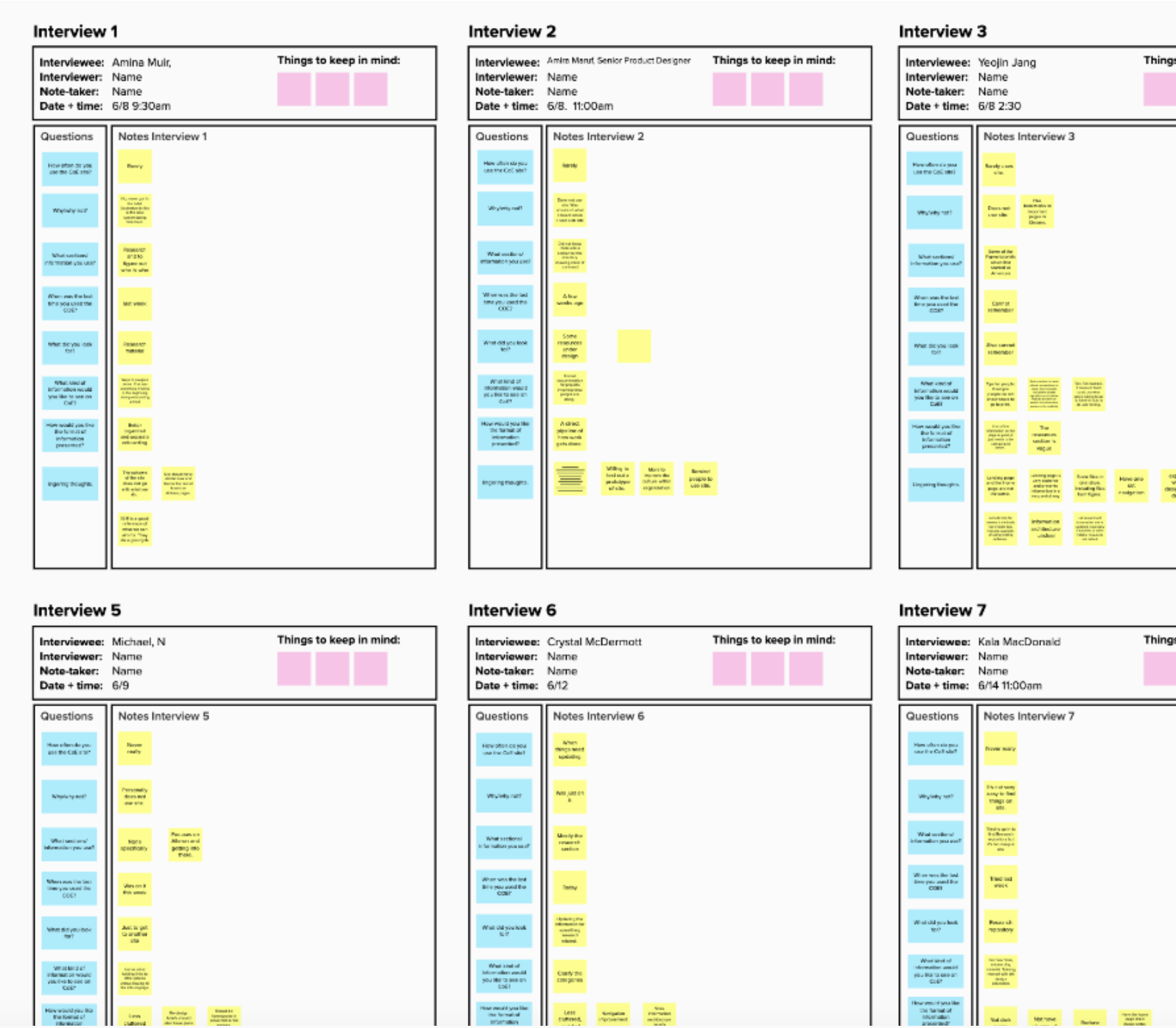
Qualitative research through in-person and virtual interviews with stakeholders
I conducted 11 interviews with members of the loyalty, enterprise, and DevOps teams to get a holistic view of how everyone utilized the central UX platform.
Interview Insights:
The site has valuable resources, but the information needs to be organized better. Improving information architecture was vital to using and implementing a new design system.
Led Design Thinking Workshop
I used Luma Institute’s Design Thinking recipes for the session, where the goal was to identify areas of improvement within the CoE site and prioritize outcomes based on time constraints.
User Insights
Users wanted an interface aligned with the company’s.
The website must be mobile-friendly and easier to navigate regardless of device.
Users wanted a better onboarding experience with links to important and useful company pages.
Usability Testing
During the usability testing, users could quickly and efficiently navigate through the main components. All the users found the resources I asked for during user testing, and the website was now desktop and mobile-friendly.
Mobile Friendly
Reflection:
As part of the DesignOps team, I learned how a mid-sized company implements new guidelines and checkpoints to improve work output throughout the 60+ person UX Department. By improving the information architecture of the department’s Center of Excellence site, I was able to help leadership streamline some of the new department roll-outs, such as defining and explaining the design checkpoints for Product Designers, providing easy access to the department’s Design System for software developers, and ensuring all content met accessibility standards. My time at American Airlines taught me how to work within an agile environment and the importance of communication within the department and external stakeholders.


