Capstone for Maryland Institute College of Art M.P.S. degree in UX Design Fall 2024
-
Role
UX Designer, UX Researcher
-
Timeline
September-December 2024
-
Tools
Figma, Airtable, Zoom
Background
College students face challenges with disposing of unwanted items at the end of the semester. This leads to unnecessary waste, inconvenience, and missed opportunities for item reuse or donation.
How Might We…
How might we create a platform that encourages and simplifies the reuse and donation of college students' belongings?
Every year, college campuses face a surge of waste during move-out periods. Students often struggle to manage unwanted items like furniture, books, and clothing, leading to waste and stress. Stakeholders such as universities, sustainability advocates, and students themselves want to solve this issue by fostering a more efficient and environmentally friendly process.
Problem Statement
Discover
The competitive analysis highlights the strengths and weaknesses of existing platforms like Facebook Marketplace, Craigslist, OfferUp, Freecycle, and Nextdoor. While these platforms offer features like community focus, environmental benefits, or extensive user bases, none provide a tailored, student-centric experience with the integrated safety and sustainability features that CampusSwap offers.
Discovery Interviews
I conducted three interviews with college students over Zoom. Through these interviews, I found the main issues for current platforms for item exchanging and what college students want to use.
User Persona
CampusSwap Journey Map
The CampusSwap Journey Map illustrates how the app addresses student needs at every stage, from awareness to loyalty, by providing a safe, convenient, and sustainable solution for exchanging items.
My user persona represents the everyday college student who is busy with school but also wants to live sustainability in the most convenient way possible.
Design
The design of CampusSwap evolved significantly through iterative development, transitioning from low-fidelity wireframes to a polished high-fidelity prototype.
The low-fidelity wireframes focused on basic layout and functionality, providing a skeletal framework for key screens like listings, messaging, and profiles. These initial designs allowed for rapid feedback on structure and navigation.
In the mid-fidelity stage, greater attention was given to visual hierarchy, spacing, and user flow. This phase introduced placeholder visuals and typography, refining the app's usability and addressing user feedback, such as improving button placement and message clarity.
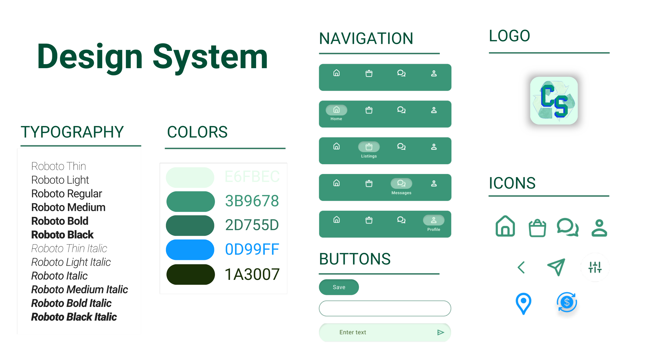
Finally, the high-fidelity prototype brought the design to life with cohesive branding, color schemes, and interactive elements. Enhanced visuals, polished icons, and realistic content created an engaging and professional look while maintaining the user-centric functionality validated in earlier stages.
UsabilityTesting
I used the RITE rapid iterative testing and evaluation method to iterate on my prototype quickly. I conducted three rounds with two users each time.
Listing Iterations: In Round 1, users found the visuals unappealing, particularly the listing images, which lacked clarity and focus. The images overshadowed titles, and the lack of visual hierarchy in the sorting buttons made navigation difficult. In Round 2, adjustments were made to improve spacing and layout, but users still found the images unsatisfactory and noted that the sorting buttons were hard to differentiate. Finally, in Round 3, we enhanced the visual hierarchy of the buttons, ensuring clear differentiation between active and inactive states. Improved image quality and spacing within listing cards created a cleaner, more user-friendly design. These iterations demonstrate the importance of user feedback in refining functionality and visual design to deliver an intuitive and engaging experience.
Map Iterations: In Round 1, users found the location icons challenging and expressed frustration about the lack of item visibility near their locations. In Round 2, we adjusted the map’s colors and added filters, but users still noted insufficient contrast between the icons and the map. However, they appreciated the addition of nearby item markers. Finally, in Round 3, we introduced redesigned icons with improved contrast and added subtle drop shadows for greater visibility. These changes addressed user concerns about clarity and usability, creating a map that effectively supports quick, intuitive navigation. This iterative process highlights the importance of user feedback in shaping accessible and user-friendly design elements.
Messages Iterations: In Round 1, users highlighted uneven profile image circles and inconsistent spacing, which made the interface feel cluttered. These issues impacted readability and the overall user experience. In Round 2, adjustments were made to introduce a distinct color for unread messages, improving visibility and prioritization. However, feedback indicated that spacing between message elements still required refinement. In Round 3, we implemented even padding across the interface, further differentiated unread messages, and added color-coded message cards for better organization and clarity. These refinements resulted in a cleaner, more intuitive design, ensuring users could easily navigate and manage their messages. This iterative process underscores the importance of user feedback in creating a seamless and visually cohesive messaging experience.
Final Prototype
The final prototype showcases a polished, user-friendly design with intuitive navigation, cohesive branding, key features like in-app scheduling, secure messaging, and streamlined item listings tailored to college students.
Reflections:
This project highlighted the importance of iterative design to address diverse student needs. While the solution was validated through research and prototyping, it reinforced the understanding that no solution fits all college students. CampusSwap’s development would require ongoing iterations to adapt to evolving user expectations. Key challenges included managing time effectively across the research and design phase, improving user interface design skills, and ensuring that designs were feasible and user-friendly. These experiences underscored the value of balancing user feedback and addressing technical constraints while focusing on creating an intuitive and impactful product.


